Features
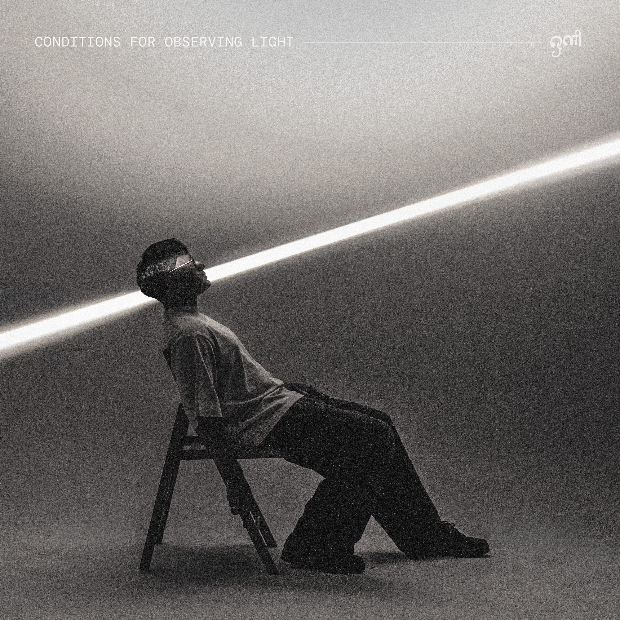
Behind the Artwork: Cephas Azariah 'conditions for observing light'
Last month, we released the second album from Cephas Azariah, 'conditions for observing light' - a work driven by Cephas’ constant desire to find positivity, or ‘light’, amidst darkness. This theme is beautifully mirrored in the album's sonic journey, which features delicate moments of light-hearted piano before building toward a profound, euphoric brightness.
With such a visual inspiration behind this project, it was only right that Cephas’ vision be paired with some equally striking visuals. That’s where Anjunachill’s resident designer and photographer, Rosalind Clarke, came in. Now, we talk to her for some behind-the-scenes insights into the eye-catching album artwork…
Tell us about yourself! What is your background in design, and what other artworks might fans recognise of yours?
So I came into design a little later - I decided to go back to uni to study graphic design at 26. Once I graduated I had an internship with a publisher and then got an internship at Anjuna. The rest is history! Some of the other artworks I have designed are obli’s ‘Soft Speak’, Mark Barrott’s ‘The Exit Diaries’ and several Cephas artworks now, the most recent being ‘a liturgy for grief’.
How did you conceptualise the artwork for ‘conditions for observing light’?
When Cephas and I first met to discuss the artwork back in February, he talked a lot about each song having a different quality of light - ‘sakura’ almost being very soft, like candlelight, whilst ‘lightning’ would be explosive light. My challenge was then how to conceptualise this without it being too on the nose. I have worked with Cephas a few times before so I knew that having a strong narrative and concept would be what Cephas would want, so it was a case of coming up with some options and regularly discussing with him. It became a really collaborative process.
What inspired the visual aspects of the shoot, and how did you turn those photos into the final artwork?
Cephas was very inspired by the physics of light, hence you see symbols and equations on the inside sleeve. Cephas also wanted his native Tamil as a translation of all the songs, so that was a big driver in terms of type layout, and how to have it cohesive across all the artworks.
How did you design the full physical product, with the additional inner sleeves?
This was the really fun part! Here we could really delve into the concept of light as different colours on the wavelength spectrum - so we saw the full spectrum on the labels. The inner sleeve needed to be subtle so as not to detract from the symbols. Lastly, the tracklist is always a fun thing to design. I utilised the line from the front covers, to almost create a ‘constellation’ of song titles - again referencing Cephas’ love of the physics of light.
What else have you shot with Cephas?
I have shot a few things with Cephas now, so it’s always nice to work with him again as I feel I know how he works and what sort of things he likes! I like how Cephas really loves the process of making artwork and analogue techniques, much like his music. We also recently did a live performance video of a few of his songs from the new album - you can watch those now on the Anjunachill YouTube channel.